
INPS Quantitative data analysis
Testing design hypotheses via quantitative UX research

Activities
Analytics, survey analysis, clustering, quantitative personas, user test preparation
Role
UX Researcher
Scope
Analyze website activity and survey data to inform UX design and usability questions
Summary
In a more junior UX researcher role, the 2nd part of the INPS saga saw me analyzing analytics data and a survey to gain a quantitative UX perspective to inform usability tests and validate or reject user personas. In the first phase, I was given a 2 month dump of traffic history data from INPS. By categorizing the individual pages and performing descriptive statistical analysis, I translated the raw traffic data into valuable knowledge on the top entrance points and user flows through the website, and where users appeared to experience issues. I visualized the data using methods like tree maps to showcase the most visited categories of pages, enabling a high-level view of the website traffic. The next phase entailed launching a survey to get feedback from two major user types: citizens and accountants. I helped define the survey scope, questions and structure. After collecting 3886 responses, I pre-processed, cleaned and explored the data to check for possible correlations. After hypothesis testing, I delivered a comprehensive report detailing statistical differences in age group and user type. Using a more advanced cluster analysis, I was able to test the qualitative data used for the user personas, delivering newly validated quantitative personas, along with indications for usability testing.
The INPS Saga pt. 2
This follow-up INPS project (see part 1) aimed at integrating quantitative data into previously done qualitative research done on the Information Architecture and pain points of the INPS website as a whole. My task was to analyze analytics data and help with the design and analysis of a survey to investigate:
- sporadic use with little awareness of MyINPS functionalities
- tendency to mostly use the website to learn about services
- relying on external help with navigation
- poorly grouped benefits
- emotional dimension of using the website
- language used on the website
- disorienting amount of news
- overly generalized content
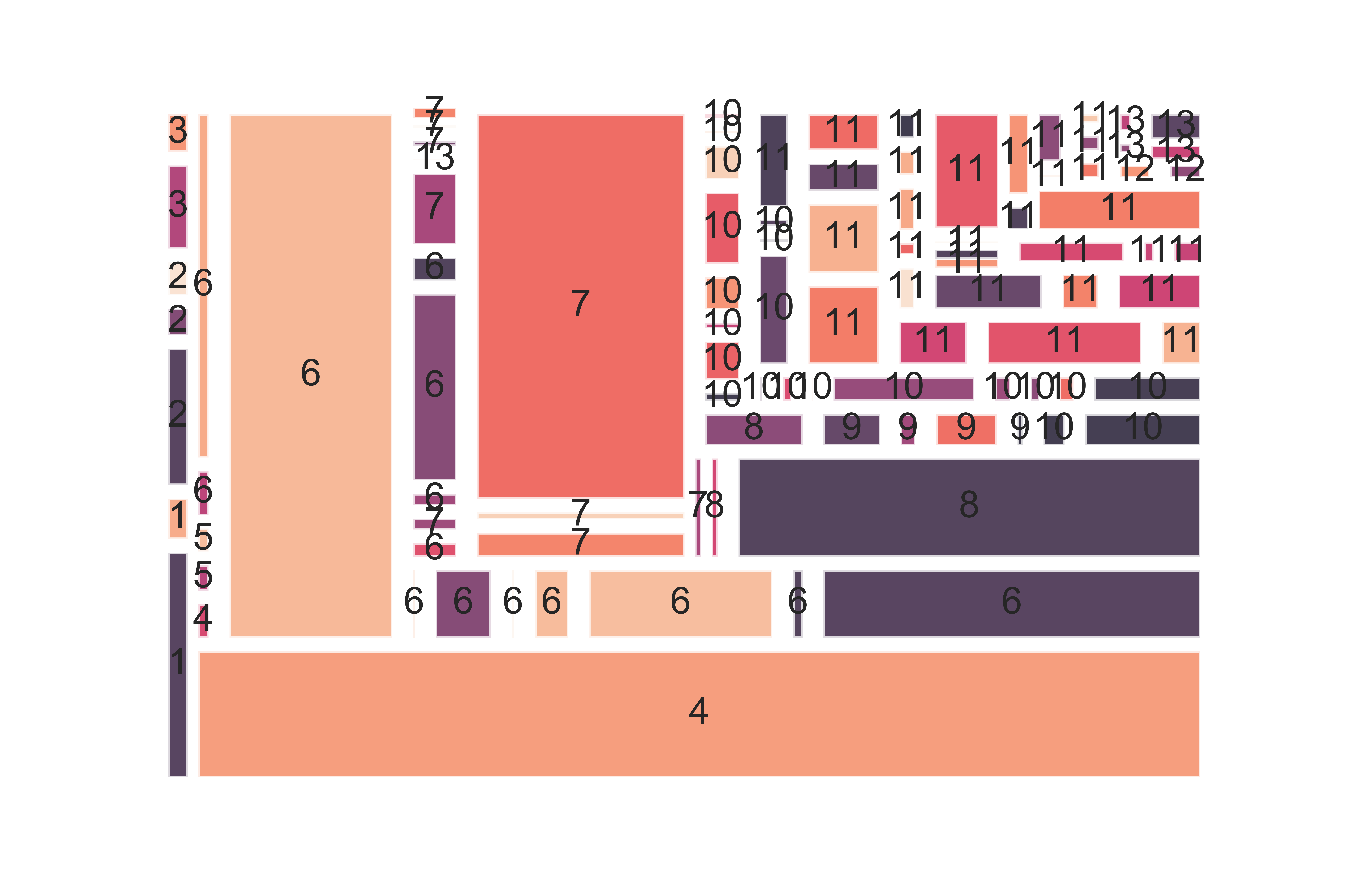
Analytics
Making sense of INPS traffic data and visualizing it
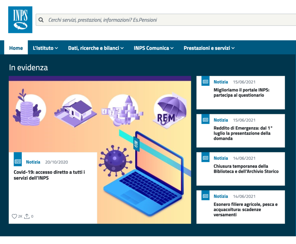
To start, I was given 2 month’s worth of traffic history data from INPS, including pages visited, bounce rates and points-of-entry. To get higher level insights, I categorized the individual pages into 13 groups based on the sections of the website they were found in. I then aggregated the data and ranked the most used sections of the website and how users got there. Using histograms and tree maps I visualized the most visited areas of the website and indicated which sections and specific service/benefit pages could be causing problems based on the bounce rates and average time spent.
Crafting a well-designed survey for millions of users
Designing a survey for a public administration comes with a big responsibility. To make sure we were creating a balanced survey, I worked with lead UX researchers and internal stakeholders to tweak questions. I also calculated the number of responses needed to ensure a 99% confidence level. Luckily a week after launch we had more than enough responses to constitute a statistically significant sample.
Survey data pre-processing, explorative analysis and hypothesis testing
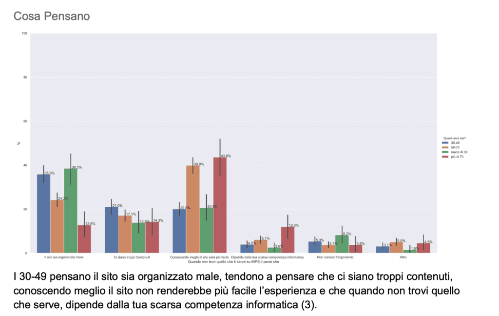
In all, 3886 people responded to the survey, with a 90% completion rate. Using a combination of Excel and Python, I proceeded to clean and pre-process the data to allow for analysis. After this very tedious process, I was able to explore the data, producing some initial visualizations to get an overview and check for glaring patterns in the data. I then set about testing some of the hypotheses that were defined before the launch of the survey, as well as checking for differences between responses in terms of sex, age and target group (citizens vs accountants).

Reporting
With Python as my weapon of choice, I tested for correlations between these independent variables and survey responses , as well as chi square tests to check for statistically significant tendencies according to each age group.
These visualizations were detailed in a report explaining insights and differences between the groups of users.
Results
Quantitative personas and data-driven implications
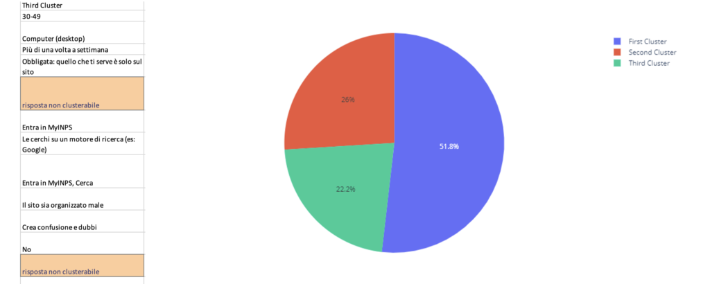
Integrating this new information with the personas resulting from qualitative research led to the elimination of one persona, with her (Giada) attributes being combined into two others based on the insights gained from the survey analysis. To further test the personas, I was inspired to run a cluster analysis to see if the characteristics ascribed to the personas were reflected as such in the data. This required some feature selection, which meant standardizing the data and removing questions which had no statistically significant differences between responses chosen.
One bias in the survey design meant that the responses about the frequency of use was to be taken with a grain of salt; given that the survey was available on the website for a week, participants who used INPS more often were therefore more likely to respond. Regardless, 3 clusters proved to be the most stable and led to further indications for the new quantitative personas, creating design artifacts that were more accurate, representative and useful. These insights were then taken advantage of to define the objects and create the tasks for a round of usability testing.
Takeaways
It's easy to get lost in the numbers
- Project complexity was undersestimated, lack of communication about timeframes compounded issues
- Under tight deadlines, use any tools necessary to make work easier rather than stubbornly sticking with one tool (It’s a little easier to make nice looking graphs in Google Sheets than Python 😅)
- Since most of us aren’t data scientists, the presentation of quantitative analysis is fundamental to its usefulness and value