
INPS Digital consultant
Helping citizens save time and claim benefits

Activities
Interviews, workshops, journey mapping, user flows, wireframing, prototyping, UI
Role
Principal Researcher & Designer
Scope
Research and design a new kind of digital consultant to help citizens discover unclaimed benefits
Summary
Beginning with the concept of a “digital consultant”, my team – the Head of UX, myself as principal UX designer and another junior researcher – wanted to help find an innovative way for INPS to interact more efficiently with citizens and guide them through application processes to claim important benefits. By interviewing internal stakeholders we learned about their pain points and the problems citizens have when interacting with INPS. Then, through a brand attributes workshop we discovered how INPS wanted to present itself to citizens through this digital consultant. After mapping the current user journey to apply for a supplement to their pension, a breakthrough occurred when we identified a crucial point where INPS and citizens were wasting time, energy and money: benefit applications that were rejected because of basic errors and ineligibility. After developing user profiles, scenarios and user journeys to-be, we began to formulate the idea of a simple wizard to guide citizens through the application process. From sketches to wireframes we quickly iterated design proposals to visualize how the wizard would act. I painstakingly replicated the INPS design system to create high fidelity prototypes and deliver a fine-tuned user experience. While differing slightly aesthetically due to technical reasons, 5 months after launch of the final product, the service had been accessed 200,000 times, and has led to a 10% increase in “fourteenth month salary” applications and a 20% increase in pension supplement requests. By integrating AI to process the results of the wizard, there are fewer errors and INPS can proactively reach citizens who might be eligible for benefits.

Clippy Reloaded
Starting with unclaimed retirement benefits, INPS challenged us to design a digital consultant that could guide citizens in activities such as filing applications, requesting info and using online services. The metaphor used to visualize the envisioned solution was Clippy…a bit strange as a guiding light given its notoriously maligned reputation.
Research
Identifying the problem space through stakeholder interviews and workshops
In tandem with state-of-the-art literature review and benchmarking, our exploration of the problem space focused on the bureaucratic context, interviewing several INPS employees in various departments to understand how things work behind the scenes and the challenges they face.
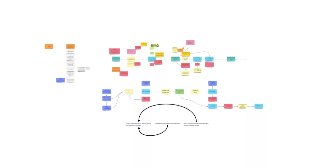
These interviews also provided insights into the frustrations of their users: an interesting mirroring effect where an error caused by a citizen creates problems for INPS employees and comes back around to affect the user, a frustrating situation for all involved. After workshopping brand attributes of INPS with close to 20 participants and co-mapping a typical user journey with an INPS stakeholder, the path forward was revealed: eliminating wasted time and effort for both citizens and INPS by intervening before the official application process.
Visualizing the contextual scope
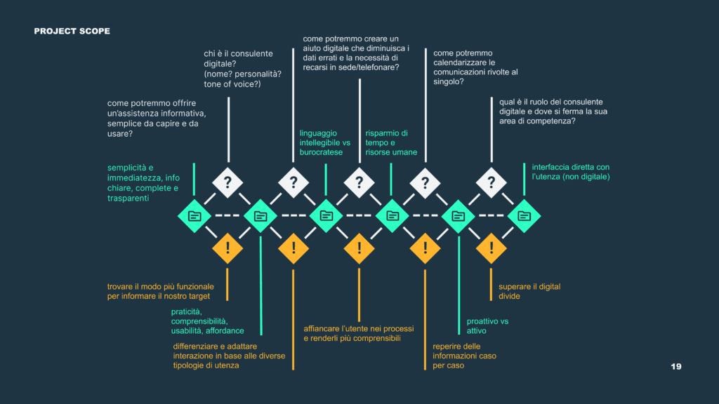
In order to encapsulate the full complexity of the project scope, I mapped the forces at play for a digital consultant, highlighting the interactions between themes, challenges and design questions.
Design
Entering the minds of the user to create a better experience
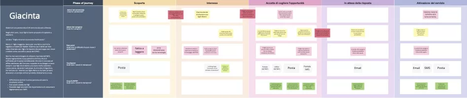
To start translating this idea into a design proposal, we created 4 stripped-down user profiles (one downside of the project was not having a chance to talk to our target users) and citizen journeys to-be. Here we were able to begin facing the constraints we had to design within and quickly explore various avenues such as phygital solutions, delegated account users, notifications and contact center calls.
Project drawbacks
A huge gap in the project was not having the opportunity to speak with our target users, instead relying on anecdotal accounts from internal stakeholders and first-hand experience trying out the online services platform. Therefore we were unable to test our assumptions of citizens’ wants, needs and pain-points directly. In my opinion some of the time spent going over and refining our presentations could have been better used on interviews with some retirees.
A surprising multi-channel solution
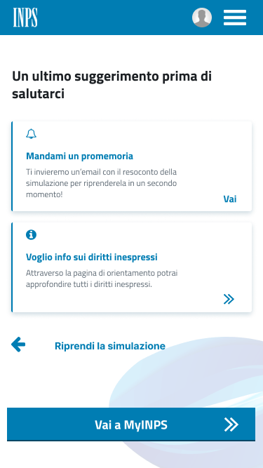
Given the complexity of the problem, we approached the solution using systems-thinking. We saw the digital consultant as being situated in an ecosystem, with the ability to manifest itself and come into contact with citizens in various forms: online services, a chatbot, an online wizard, emails, notifications, as well as physical media like letters and postcards. However, as resources were limited, we knew that we had to focus on one solution at a time. Guidance and quick assessment of application eligibility were our most important design goals, and so an online wizard became the point of focus and represented the option that seemed most feasible and innovative. Before sketching anything we settled on 3 user flows in order to visualize the scenarios we would begin designing.
Content-first design
The design phase then officially began with wireflows, simple wireframes to visualize how user could first become aware of a benefit and quickly see whether or not he/she was eligible. This was very much a content-first design approach, as the wording and order of the questions in the wizard was critical. We also tackled the issue of inclusivity, initially advocating for the use of the schwa for referring to citizens to avoid gendered language, a difficult proposition given the target language was Italian. In the end this was seen as potentially alienating for the target user base, and we instead opted for the use of the pronouns he/she when necessary.
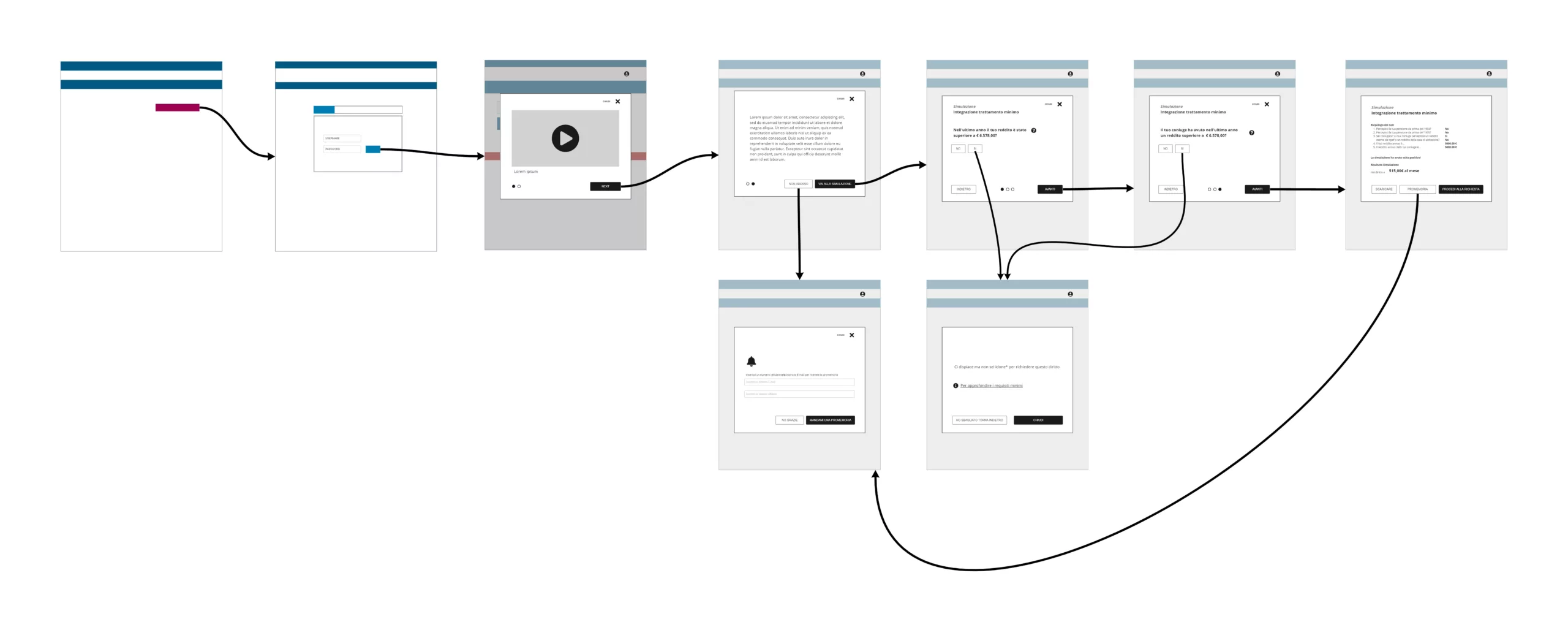
Rapid prototyping
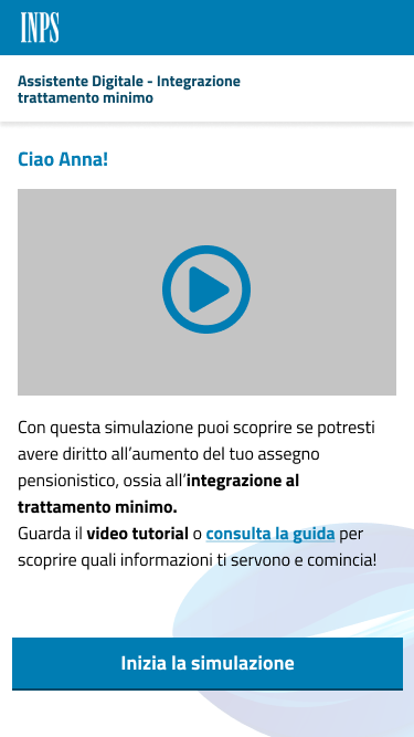
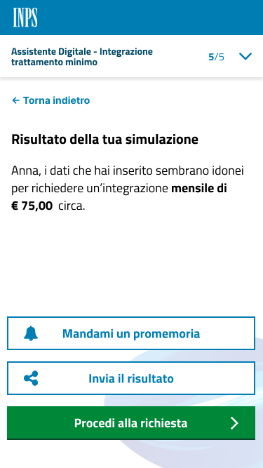
After presenting the design concept, we moved onto designing the user experience, resulting in 3 interactive prototypes. As most users interact with the INPS website from their smartphones, we opted for a mobile-first design approach, reutilizing components from the INPS design system webkit. The prototypes focused on accessing the wizard from an email and from an online service page. With a positive result, the user would be able to directly continue to the official application, using data already filled in. In the case of a negative result the wizard supplied a pathway forward providing information on why he or she was ineligible. By limiting the number of steps and providing options to save progress or receive a reminder we stressed flexibility in the design and a way to make the experience as painless as possible.
Feedback was ominously minimal, but it was clear the client was a bit surprised by the direction we had taken with the prototypes. Perhaps they were expecting something akin to a chatbot, however in this case engaging retirees would be a major obstacle for a chatbot. The wizard represented something more recognizable, yet capable of empowering citizens to become aware of their unclaimed benefits.
Results
A successful launch that has empowered over 200,000 users
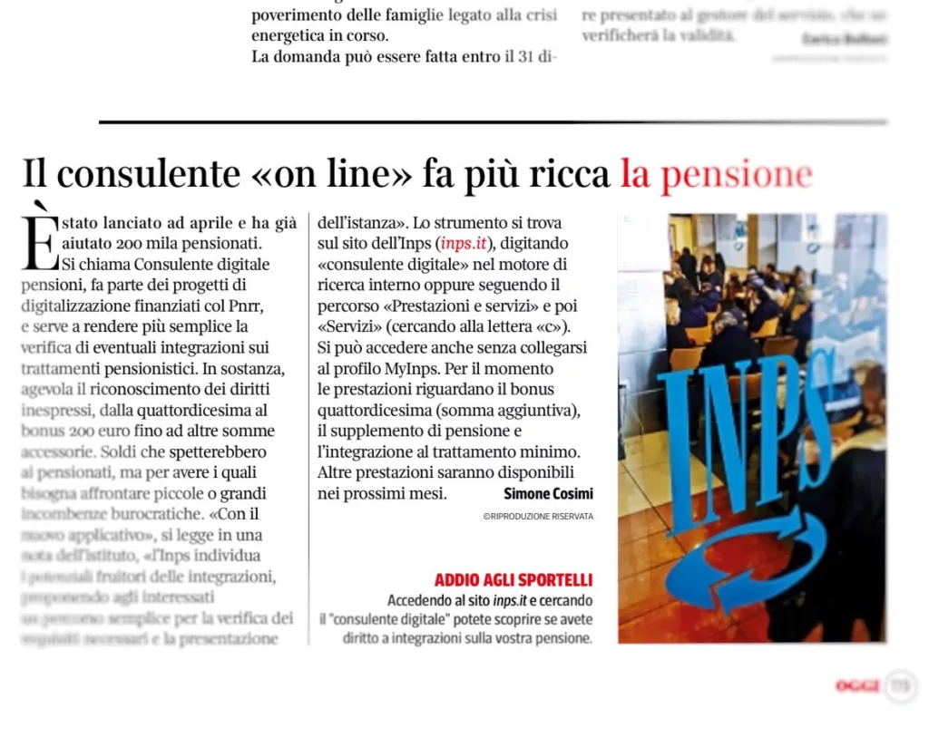
“The online consultant that makes retirement richer”
In the end it seems our persistence and vision paid off. After spending almost a year in development, the digital consultant launched in April 2022. Although different in terms of aesthetic, the functionalities we designed remained the same and the wizard delivers personalized results in minutes. After 5 months it had already helped 200,000 citizens, seeing a 10% increase in “fourteenth month salary” applications and a 20% increase in additional retirement supplement requests.
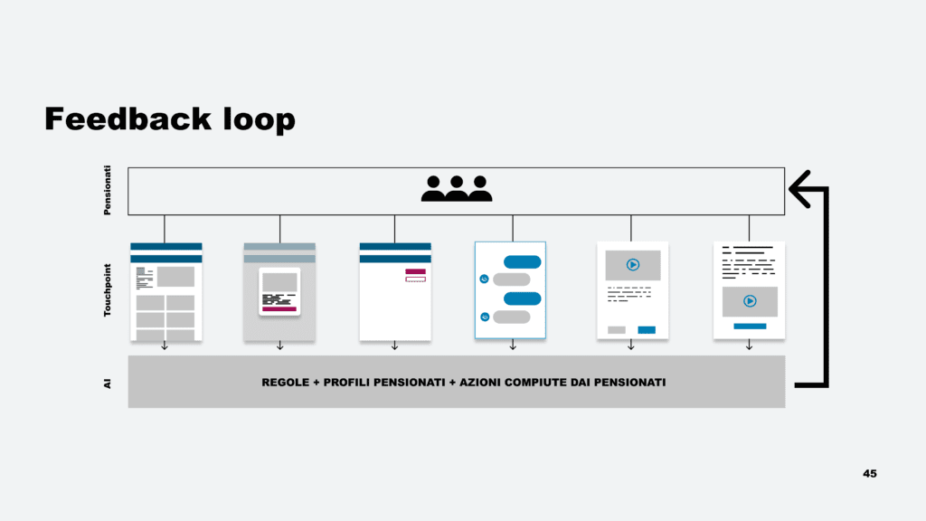
Mission accomplished: the added benefits of our solution’s feedback loop
By integrating AI, eligible results from the wizard are able to transfer data from the wizard to the official application, reducing errors and saving time and effort. The system’s ability to proactively engage with citizens marks another hallmark of the ecosystem we proposed: a feedback loop that enables INPS to learn more about its citizens and provide personalized guided assistance to each one. Proactive messages and quick responses are the real win here, because we all know how fun it is when we miss out on benefits because we didn’t even know about it or it took too long to get an answer.
Takeaways
A rewarding project not without issues
- Direct interaction with the target: interviews with senior citizens to understand how they speak about claiming benefits, user testing of initial wireframes would have allowed for some much needed tactical research
- We constantly faced challenges of privacy and understanding the types of data we had access to. Having a map of the INPS ecosystem would have solved major headaches due to not fully comprehending the interactions between different departments
- Timing is a crucial aspect of an ideal digital consultant, and in this case empowering the user with timely information about their benefit eligibility proved to be one of the killer features of the wizard